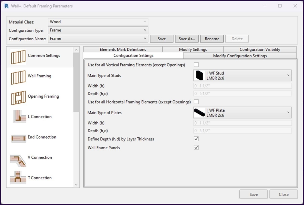
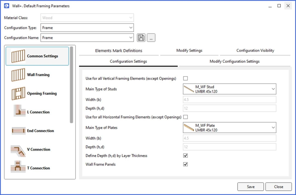
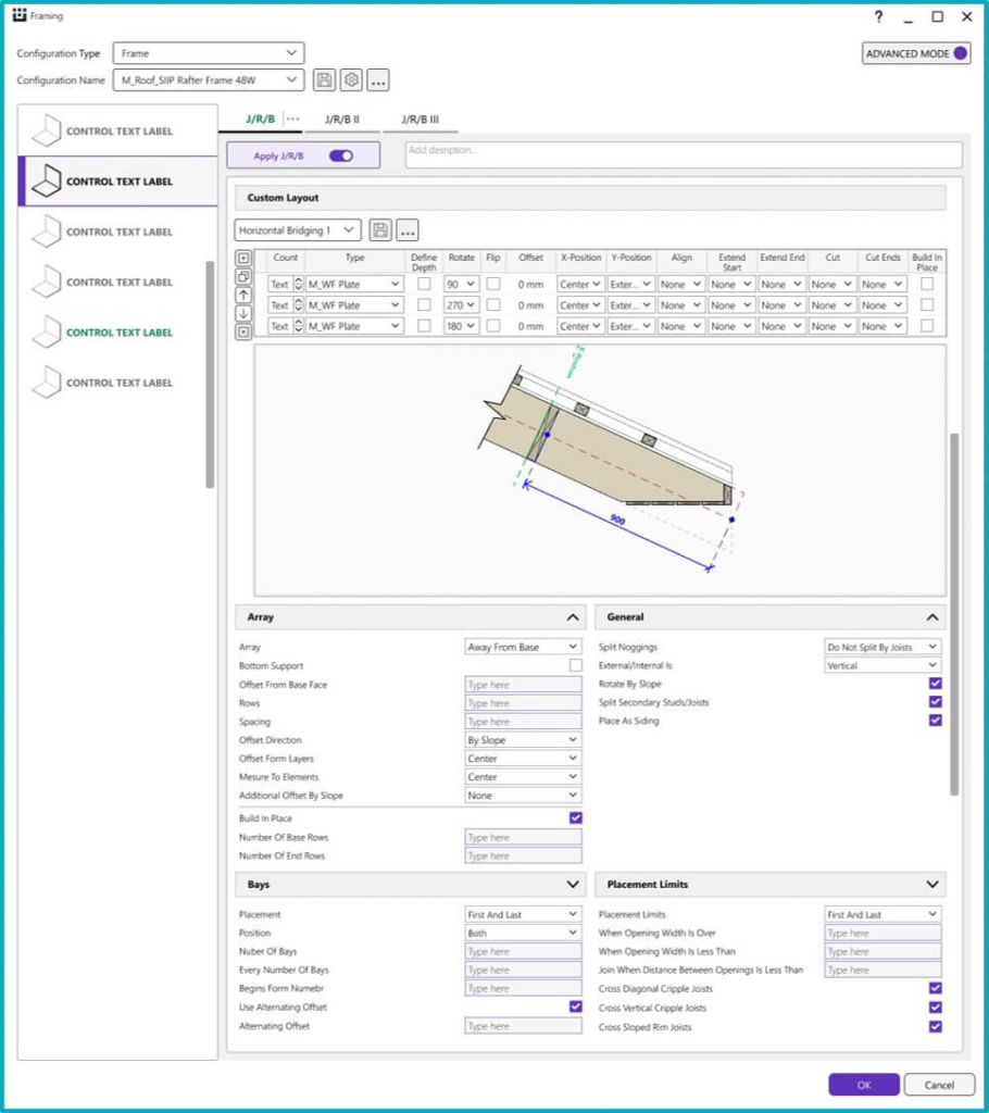
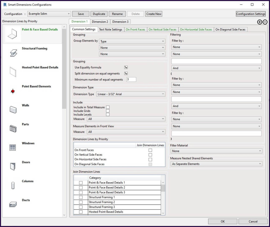
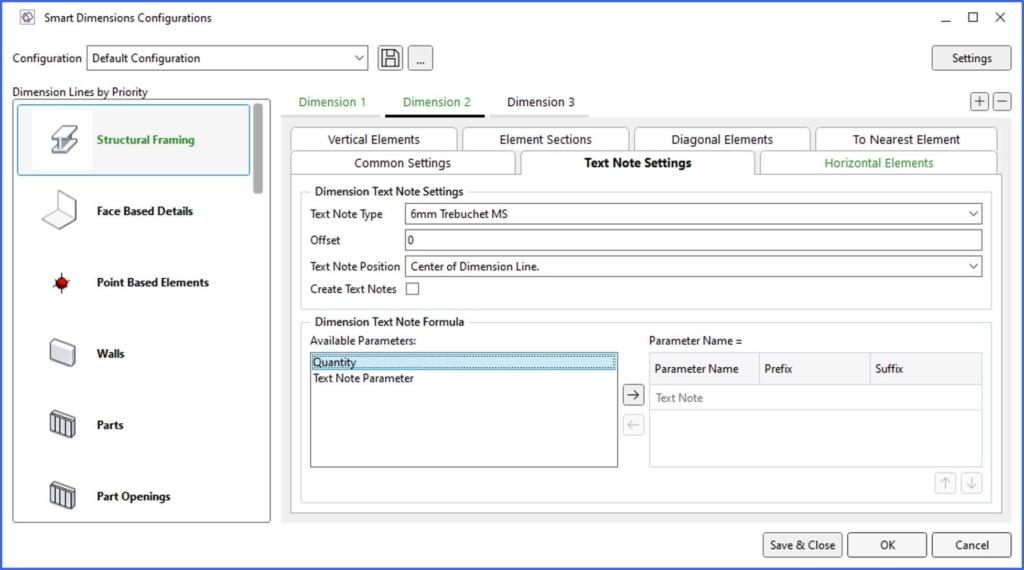
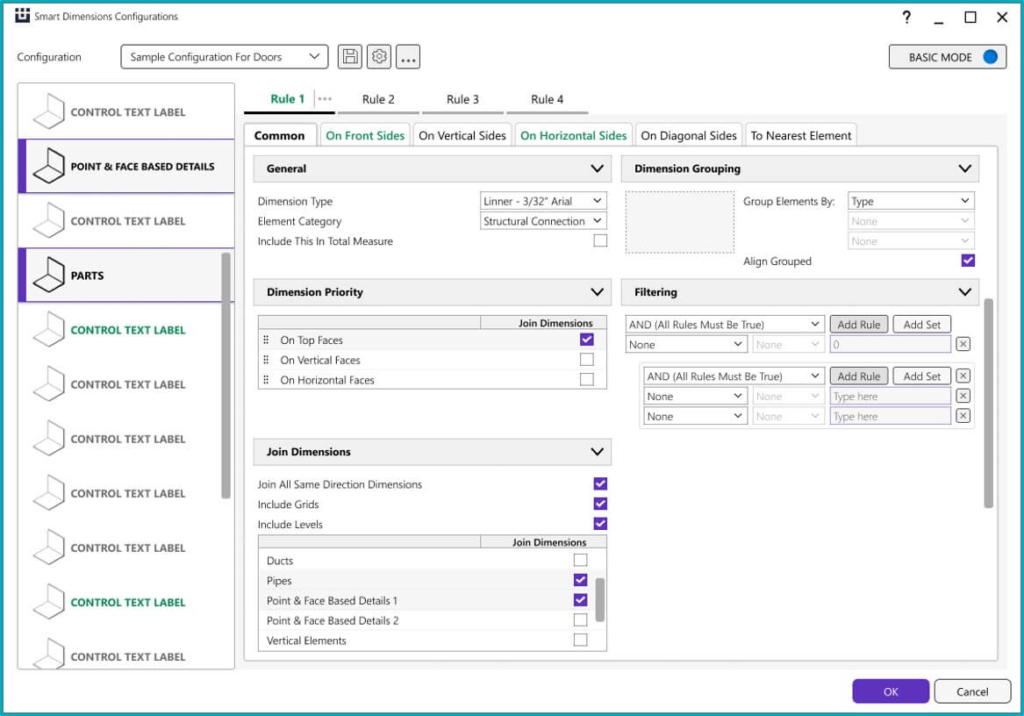
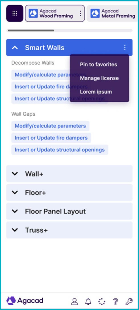
A recent major development here at Agacad is the new user interface that we’ve implemented for all products.
In addition to incorporating the colors and icons that came with our company rebranding, the UI was remade so that the underlying software is easier to use.
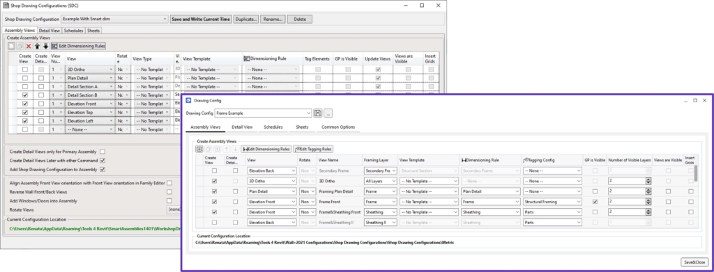
User benefits
With the new UI, everything is about simplicity. We structured it differently so that it is more intuitive and easier to use. And easier on the eyes, too.
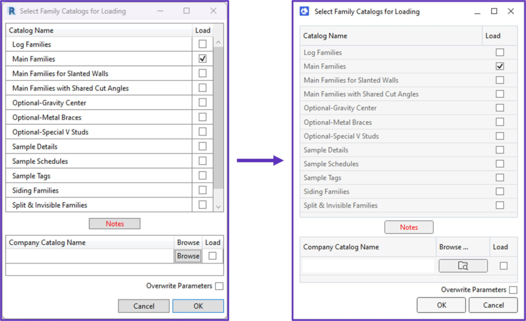
Just as we drive performance through process improvement, we strive to make the software that gets you there as convenient as possible to use. For complete satisfaction.
What’s next?
We’ve worked a lot to improve the Agacad UI in recent months. And we’re continuing to work on it. Truth be told, the latest UI is just one more step toward our UI of the future.
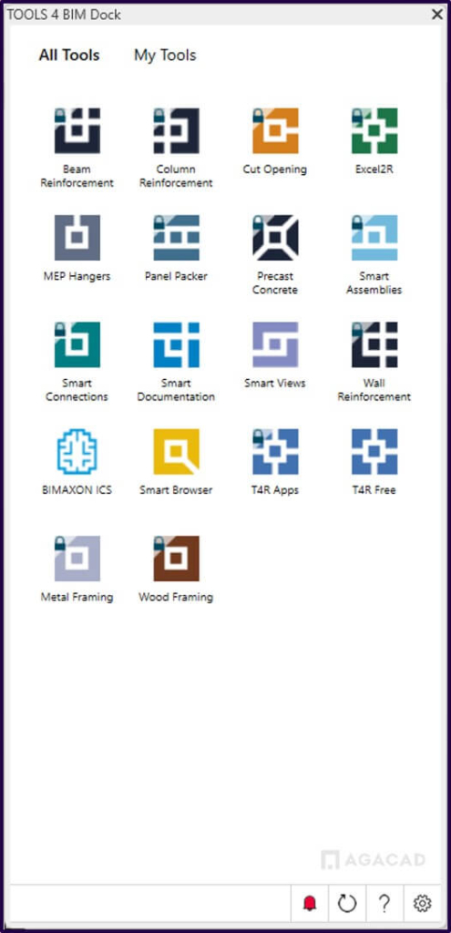
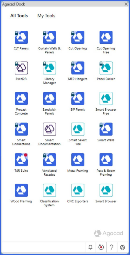
The Agacad Dock
We recently released the rebranded Agacad Dock to match the new colors and product icons, but we’re not stopping there. The future Dock will be completely redesigned. Here’s a taste of how it will look.
Aside from looking quite different, performance and usability of the Dock will be further improved.
Stay tuned for more developments.

